Clear
Every move has a reason: to show where something came from or where it went.
One curve and three timings. Small things are quick, most moves take the base timing, big moments are slow.
Three habits behind every move. A new animation that follows them will feel like ours.
Every move has a reason: to show where something came from or where it went.
Motion guides attention to what matters, then gets out of the way.
The same kind of moment always moves the same way.
One curve and three timings cover everything. Small things are quick, most moves take the base timing, and big moments are slow.
cubic-bezier(0.2, 0, 0, 1)Fades take about 50% of the move they go with.
:root {
  --ease-arrive: cubic-bezier(0.2, 0, 0, 1);
  --duration-fast: 170ms;
  --duration-base: 360ms;
  --duration-slow: 950ms;
}

.element {
  transition: transform var(--duration-base) var(--ease-arrive);
}
With reduced motion turned on, every move becomes a short fade. Nothing travels, spins or scales.
The calls that come up in almost every screen.
Arriving
Fade in, then settle on our curve.
Bounce, spring or overshoot.
Waiting
Move on the moment the work is done.
Hold anyone back so an animation can finish.
Comfort
With reduced motion on, replace every move with a short fade.
Shake, flash or spin large parts of the screen.
Moony speaks with calm clarity, radical openness, and warm confidence. We make complex ideas easy to understand, support every claim with transparent facts, and treat people as capable participants in an open network.
Our language is concise, human, and globally accessible. We communicate the practical value of Moony without hype, speculation, or unnecessary technical jargon.

Make complex financial infrastructure feel simple and understandable. Use plain language, short sentences, and explain technical ideas without sounding technical.
Send money anywhere in seconds. No bank account needed.

Earn trust through facts, transparency, and verifiability. Be specific about how the system works, who is involved, and what people can verify for themselves.
The supply is fixed at 21 million. The public code cannot be changed.

Speak to people as capable participants, not passive customers. Be welcoming, inclusive, and optimistic while staying grounded.
Your money moves with you—across the room or across a border.
Website and campaigns: Optimistic, simple, and led by practical benefits.
Product UI: Brief, direct, and reassuring.
Education and support: Patient, conversational, and never patronizing.
Social and community: Warm, participatory, and lightly playful.
Protocol documentation: Precise, neutral, and verifiable.
Safety, policy, and legal: Factual, calm, and unambiguous.

Be clear, specific, human, and useful.

Use hype, speculation, insider language, or exaggerated promises.
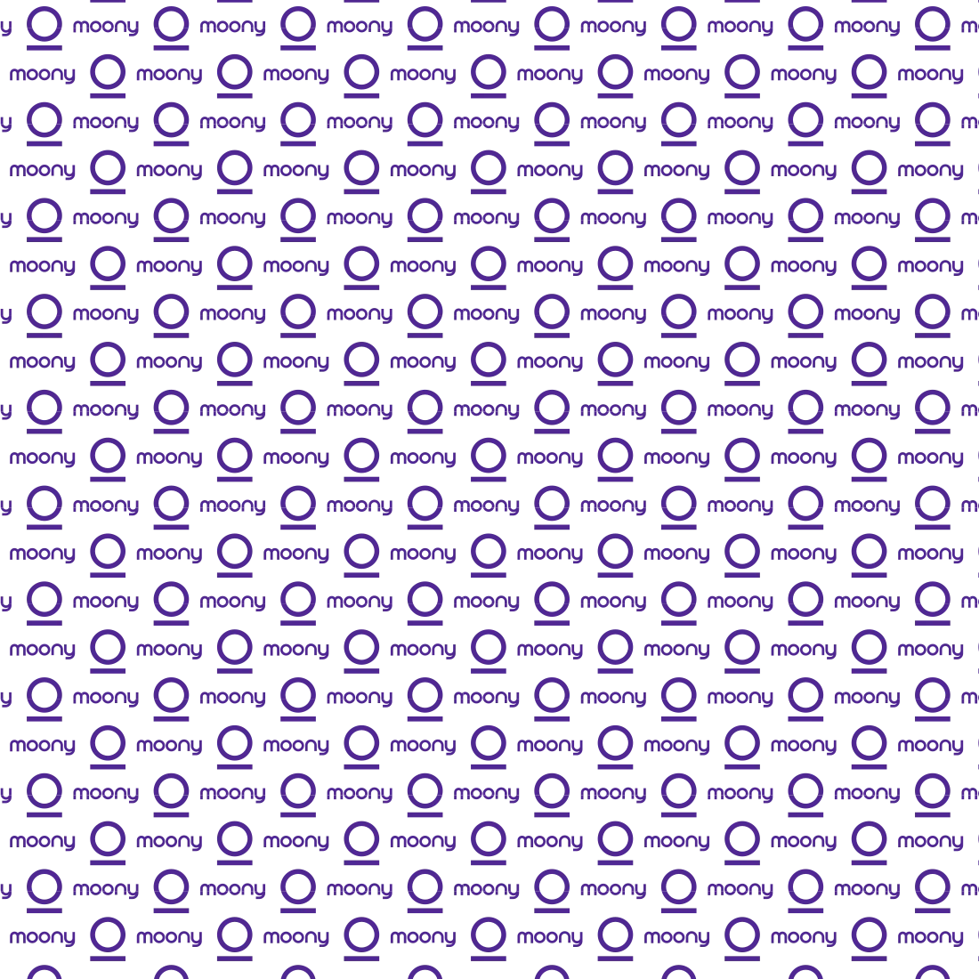
Moony’s brand patterns extend the ⍜ symbol and wordmark into repeatable layouts that feel rhythmic, calm, and distinctly recognizable. Patterns can use the icon alone or combined with the logotype, always following the core spacing and alignment rules of the system. They are best applied at a scale where the individual marks remain clear but read as a continuous field—ideal for social templates, backdrops, and subtle texture. Avoid over-crowding other content; patterns should support, not compete with, key messages.
The use of brand patterns must utilize two colors with strong contrast. Daisy Bush is the primary pattern color, while Rich Tone and Full White can be used as supporting object colors.
Moony’s gradient system translates the sunset-to-moonrise story into soft, ambient backgrounds that support the logo without overpowering it. Each gradient blends gentle peach and violet tones with smooth transitions, creating a calm, atmospheric field that keeps focus on the mark. Use the dark Moony icon as the default on gradients to ensure clear legibility at all sizes. Gradients should feel subtle and airy rather than intense or high contrast. Apply these treatments consistently across hero panels, social avatars, and key brand surfaces to keep the visual language cohesive and recognizable.







Brand strategy · Digital experiences
Ideas made visible. · moony.org